

Format
The meeting place for iconic brands and design enthusiasts.
22 December 2023
In the design of domestic environments, the influence of colors on perception and mood is a key element that is often underestimated. People tend to follow their personal taste, trends, or the advice of their trusted furniture seller without realizing that color influences the perception of the environment.
Despite the controversy surrounding it, chromotherapy has been extensively explored by researchers and interior design professionals, demonstrating the tangible effect of color in modulating the atmosphere of living spaces and the mood of those who reside in them. In fact, each shade has an intrinsic meaning and a potential psychological influence.
An interior designer who is attentive to the needs of the client, such as our experts at Format Progetti Abitativi, knows how to choose the best colors for a residential context, going beyond mere wall painting and considering the use of different materials and textures.
Determining the desired atmosphere in a room is a crucial first step. This orientation defines whether to opt for warm shades, often associated with feelings of warmth and comfort, but also with emotional impulses, or cool shades, which can evoke feelings of calm but sometimes be associated with sadness or melancholy. The approach to color therapy involves evaluating the main function of each environment and selecting a predominant shade. Although the connection between color and emotions is largely subjective, industry experts suggest that certain shades can favor specific activities.
The practical implementation of this theory involves the careful selection of materials to express the predominant shade, followed by the enrichment of spaces with details such as accessories, curtains, and artwork, using tonal variations for visual coherence.
At this stage, the moodboard becomes crucial, a sophisticated visual composition of images and materials that plays a fundamental role in interior design, anticipating the style and concept of a space. Moodboards are based on the premise that fully understanding aesthetic goals is essential before undertaking furnishing projects. Their creation requires a thoughtful approach, starting with careful listening to the client and developing a dominant style, a mood that permeates the environment.
Through the eloquent use of color, light, and the careful selection of materials, the moodboard becomes a powerful tool in defining the aesthetics of a space, anticipating the emotional experience in each room.
Chromotherapy offers an interesting and effective approach to influencing mood and sensations through the choice of colors in furnishings. Selecting a conscious color palette, considering the style of furnishings, specific needs of each room, and personal preferences, can transform the home into a balanced and harmonious environment. The careful choice of colors not only reflects one's style but also contributes to overall well-being of the body and mind, creating an environment that inspires joy, relaxation, and serenity.
There are homeowners who decide to base their entire color scheme on neutral colors, such as total white or soft, minimalist, modern, and relaxing shades. However, this is not a mandatory choice. Our advice is to choose a shade that the client likes and balance it by incorporating nude tones, which can add a touch of elegance, sophistication, and spaciousness.
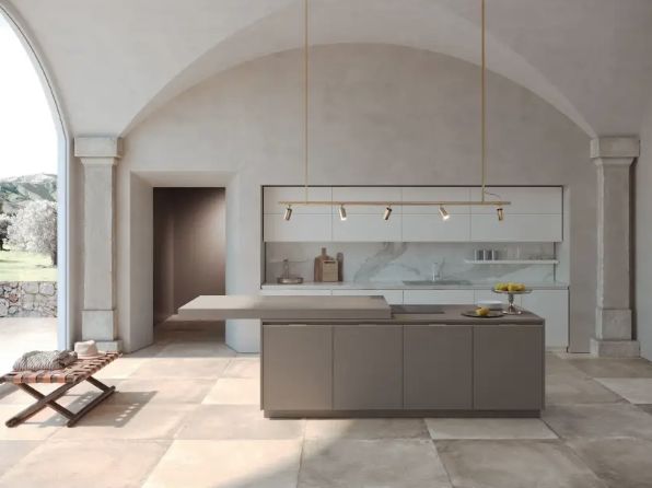
White, embodying peace and serenity, stands as a versatile choice, harmoniously adapting to any room in the house. Its intrinsic brightness contributes to creating welcoming and positive atmospheres. Brown, with its earthy hues, according to some neuroscience studies, stimulates the desire to cook, making it an ideal option for the dining room or kitchen.
Lago Kitchen - Project with neutral colors
Black, with its intense shades, promotes concentration and inner reflection. Although suitable for all areas of the house, it is advisable to use it sparingly, preferably in its matte version. The incorporation of black details adds a touch of elegance and mystery to the spaces, creating sophisticated contrasts.
Cool colors bring elegance to environments, as well as peace and harmony. Blue, with its variations of shades, not only conveys a sense of tranquility but has also been shown to lower blood pressure. However, in order to avoid excessively dark atmospheres, it is advisable to opt for lighter and brighter nuances. The careful choice of blue tones in the bedroom and bathroom can contribute to creating a relaxing and soothing environment, promoting rest and serenity.
Ray Ditre Italia armchair in cold shades
Green, with its natural shades, is a color that induces relaxation, relaxation, and reflection. This shade is particularly suitable for the dining room, bedroom, and other areas dedicated to rest. Its connection with nature adds a touch of freshness to the spaces, creating a harmonious and peaceful context.
Warm colors contribute to creating environments rich in specific, energetic, and invigorating sensations. However, they can lead to a tiring and unpleasant eclectic effect for some eyes.
Purple is known to stimulate creativity and is particularly suitable for the kitchen, living room, and bedroom, creating spaces that emanate tranquility and inspiration. Pink, considered a restful and feminine color, finds its ideal place in the bedroom, contributing to creating a cozy and relaxing atmosphere.
Theo Fiam table that gives a touch of color to the environment
Red, generating adrenaline and enthusiasm, is perfectly suited for the living room and kitchen, adding vitality and dynamism to spaces dedicated to socializing and entertainment. Orange, a color of energy and good mood, is ideal in children's rooms, the kitchen, and the living room, creating vibrant and joyful environments.
Yellow, fresh and energizing, gives the environment a clean appearance and stimulates creativity. This shade is perfect for the kitchen, living room, and area dedicated to study or work, facilitating communication and memory. Its presence contributes to creating bright and lively spaces, promoting a positive and dynamic atmosphere.
Furnishings by Foscarini, with a touch of yellow given by the Uto suspension lamp
The choice of colors at home goes beyond mere aesthetics: it constitutes a sort of visual language capable of subtly influencing our emotions and daily well-being.
Chromotherapy offers the opportunity to create environments that reflect not only the personal style of those who inhabit them but also their emotional needs. Awareness of the psychology of colors and their influence on mood allows for a more conscious and targeted design, transforming domestic spaces into personalized havens adapted to different daily activities.
Understanding how colors interact with the mind and emotions paves the way for a more conscious and targeted design, transforming domestic spaces into emotional sanctuaries that reflect the nuances of our interiority. For those who wish to translate this awareness into tangible reality, Format Progetti Abitativi is an ideal partner. With our experience and passion in the field of interior design, we can transform not only physical spaces but also the emotional experience of those who inhabit them. Turning to Format means not only obtaining a furniture project but also embarking on a unique journey of self-discovery, shaping spaces in harmony with one's emotions.